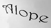


Case Study No One Bold Italic Alternate font
Publisher
MyFonts.com - $29.99*
License
$ Commercial
Date added
Dec 08 2016
Download Case Study No One Bold Italic Alternate font.
A bold, italic, and modern font with high contrast and tight spacing.
This font features a bold and italic style with a modern, dynamic appearance. It has a slightly condensed width and a high contrast in stroke thickness, giving it a strong, impactful look. The characters are tightly spaced, enhancing its bold presence.
Ideal for sports branding, dynamic posters, and modern advertising campaigns.
Headlines, Logos
Balanced
https://www.whatfontis.com/NMY_Case-Study-No-One-Bold-Italic-Alternate.font
Case Study No One Bold Italic Alternate font
103738
Dec 08 2016
https://d1ly52g9wjvbd2.cloudfront.net/img16/C/A/NMY_Case-Study-No-One-Bold-Italic-AlternateA.png
https://d1ly52g9wjvbd2.cloudfront.net/img16/C/A/NMY_Case-Study-No-One-Bold-Italic-AlternateA1.png
https://d1ly52g9wjvbd2.cloudfront.net/img16/C/A/NMY_Case-Study-No-One-Bold-Italic-Alternatea.png
https://d1ly52g9wjvbd2.cloudfront.net/img16/C/A/NMY_Case-Study-No-One-Bold-Italic-Alternatea1.png
https://d1ly52g9wjvbd2.cloudfront.net/img16/C/A/NMY_Case-Study-No-One-Bold-Italic-Alternate0.png
https://d1ly52g9wjvbd2.cloudfront.net/img16/C/A/NMY_Case-Study-No-One-Bold-Italic-Alternate01.png
Fonts
A bold, italic, and modern font with high contrast and tight spacing.
This font features a bold and italic style with a modern, dynamic appearance. It has a slightly condensed width and a high contrast in stroke thickness, giving it a strong, impactful look. The characters are tightly spaced, enhancing its bold presence.
Ideal for sports branding, dynamic posters, and modern advertising campaigns.
Headlines, Logos
Balanced
Download Case Study No One Bold Italic Alternate font.
Ideal for sports branding, dynamic posters, and modern advertising campaigns.
Headlines, Logos
Balanced
See the font with your own custom text
Category
Sans-Serif
Bold
Yes
Italic
Yes
Weight
Bold
Width
Condensed
Character spacing
Tight
Line height
Normal
Contrast
High
Overall style
Modern
X height
Medium
Cap height
Tall
Proposed projects
Ideal for sports branding, dynamic posters, and modern advertising campaigns.
Use case
Headlines, Logos
Ascender descender ratio
Balanced
Similar Free Fonts for Case Study No One Bold Italic Alternate
Hadley Alts Font
$ Free > Personal Use
Yoga Font
$ Free > Personal Use
Similar fonts for Case Study No One Bold Italic Alternate from Adobe.com
Mati Regular Font
$ Commercial > Adobe.com
Azote Italic Font
$ Commercial > Adobe.com
Similar fonts for Case Study No One Bold Italic Alternate from MyFonts.com
Case Study No One Bold Italic Alternate Font
$ Commercial > MyFonts.com
Case Study No One Medium Italic Alternate Font
$ Commercial > MyFonts.com
Similar fonts for Case Study No One Bold Italic Alternate from CreativeMarket.com
Arthouse Alt 04 otf (400) Font
$ Commercial > CreativeMarket.com
Splodge otf (400) Font
$ Commercial > CreativeMarket.com


