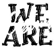


Thicker Than... Leftalic font
Publisher
License
$ Free for personal use
Date added
Jan 14 2017
Download Thicker Than... Leftalic font. Thicker Than... Leftalic by (c) Copyright 2014, Robert Jablonski/Cannot Into Space Fonts, All Rights Reserved
(Fonts by Cannot Into Space Fonts) A bold, playful, hand-drawn font with thick, uneven strokes.
This font features bold, hand-drawn characters with a playful and casual style. The strokes are thick and uneven, giving it a lively and informal appearance.
Ideal for children's books, comic strips, casual posters, and playful branding.
Headlines, Logos
Balanced
https://www.whatfontis.com/FF_Thicker-Than-Leftalic.font
Thicker Than... Leftalic font
329570
Jan 14 2017
https://d1ly52g9wjvbd2.cloudfront.net/img16/T/H/FF_Thicker-Than-LeftalicA.png
https://d1ly52g9wjvbd2.cloudfront.net/img16/T/H/FF_Thicker-Than-LeftalicA1.png
https://d1ly52g9wjvbd2.cloudfront.net/img16/T/H/FF_Thicker-Than-Leftalica.png
https://d1ly52g9wjvbd2.cloudfront.net/img16/T/H/FF_Thicker-Than-Leftalica1.png
https://d1ly52g9wjvbd2.cloudfront.net/img16/T/H/FF_Thicker-Than-Leftalic0.png
https://d1ly52g9wjvbd2.cloudfront.net/img16/T/H/FF_Thicker-Than-Leftalic01.png
Fonts
A bold, playful, hand-drawn font with thick, uneven strokes.
This font features bold, hand-drawn characters with a playful and casual style. The strokes are thick and uneven, giving it a lively and informal appearance.
Ideal for children's books, comic strips, casual posters, and playful branding.
Headlines, Logos
Balanced
Download Thicker Than... Leftalic font. Thicker Than... Leftalic by (c) Copyright 2014, Robert Jablonski/Cannot Into Space Fonts, All Rights Reserved
Ideal for children's books, comic strips, casual posters, and playful branding.
Headlines, Logos
Balanced
(Fonts by Cannot Into Space Fonts)
See the font with your own custom text
Category
Handwritten
Bold
Yes
Italic
No
Weight
Bold
Width
Normal
Character spacing
Normal
Line height
Normal
Contrast
Low
Overall style
Casual
X height
Medium
Cap height
High
Proposed projects
Ideal for children's books, comic strips, casual posters, and playful branding.
Use case
Headlines, Logos
Ascender descender ratio
Balanced
Similar Free Fonts for Thicker Than... Leftalic
Thicker Than... Leftalic Font
$ Free > Personal Use
Din Kursivschrift Eng Leftalic Font
$ Free > Personal Use
Similar fonts for Thicker Than... Leftalic from Adobe.com
Origin Super Condensed Black Backslant Font
$ Commercial > Adobe.com
Origin Super Condensed Bold Backslant Font
$ Commercial > Adobe.com
Similar fonts for Thicker Than... Leftalic from MyFonts.com
DR Krapka Rhombus Medium Upright Oblique Font
$ Commercial > MyFonts.com
DR Krapka Square Bold Upright Oblique Font
$ Commercial > MyFonts.com
Similar fonts for Thicker Than... Leftalic from CreativeMarket.com
Spektra Condensed Bold Backslant otf (700) Font
$ Commercial > CreativeMarket.com
Valencia Left Slant otf (400) Font
$ Commercial > CreativeMarket.com


