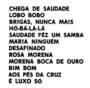
Hi everybody. This printed image is from an era before easy often digital printing and digital fonts (at least here in my country), 1990 exactly. To add more dificulty, this version is the worst produced, some error was made, adding to much or less light in the process, resulting in darker images and fonts, manny bleeding/gluing at each other, so this print don't is accurate /not faithful to the original outline of the font. Pay attention to U, M, N, A, R, X. Yes, I tried some characters and then some words, but nothing.
2 months ago
Hi CraceaA. Sorry friend, but your sugestion is very very diferent, specially the M, A, G and U. The problem here also, this site downsize the images we send, so you only can se a small picture (no many details), but thank you for the answear.
2 months ago
Hmm, thanks for the sugestion Alex, here is:
https://www.facebook.com/photo.php?fbid=6498408486918160&set=pb.100002472191467.-2207520000&type=3
2 months ago
Hello
Sorry, no close results were found.
Maybe you can use:
https://www.whatfontis.com/NFC_Mikado-Bold.font
Alex
