What fonts are similar to Architype Van Doesburg? 100 Free fonts alternatives to Architype Van Doesburg
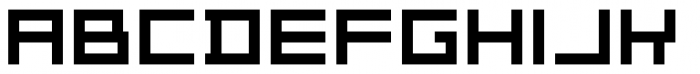
Free Fonts considered similar to Architype Van Doesburg include Theo Van Doesburg, Konstructiv, Robot Dreamer, Robot Dreamer Bold, 4Music Regular. These fonts feature features a geometric, blocky design with uniform stroke widths. The characters are constructed with straight lines and right angles, giving it a modern and structured appearance. The uppercase and lowercase letters are identical, emphasizing a minimalist aesthetic.
1. Theo Van Doesburg

Free > Personal Use
Theo Van Doesburg font
Theo Van Doesburg font
2. Konstructiv
Free > Personal Use
Konstructiv font
Konstructiv font
3. Robot Dreamer
Free > Personal Use
Robot Dreamer font
Robot Dreamer font
4. Robot Dreamer Bold
Free > Personal Use
Robot Dreamer Bold font
Robot Dreamer Bold font
5. 4Music Regular
Free > Personal Use
4Music Regular font
4Music Regular font
Our website helps you find any font from any image.
Using a catalog of over 1.1M+ fonts (commercial or free) and our font finder AI, we are able to display over 60 fonts for every image uploaded.
Give it a try!
6. NES Logo Regular
Free > Personal Use
NES Logo Regular font
NES Logo Regular font
7. Fill In The Gaps Regular
Free > Personal Use
Fill In The Gaps Regular font
Fill In The Gaps Regular font
8. Spacetime Regular
Free > Personal Use
Spacetime Regular font
Spacetime Regular font
9. Alien Energy
Free > Personal Use
Alien Energy font
Alien Energy font
10. PixelCaps!
Free > Personal Use
PixelCaps! font
PixelCaps! font
11. Digitrix Small Caps Regul
Free > Personal Use
Digitrix Small Caps Regul font
Digitrix Small Caps Regul font
12. Time Won
Free > Personal Use
Time Won font
Time Won font
13. DubbingStar Regular
Free > Personal Use
DubbingStar Regular font
DubbingStar Regular font
14. Kenney Space Regular
Free > Personal Use
Kenney Space Regular font
Kenney Space Regular font
15. Crack
Free > Personal Use
Crack font
Crack font
16. Amazing Spider Man
Free > Personal Use
Amazing Spider Man font
Amazing Spider Man font
17. Electrobyte Regular
Free > Personal Use
Electrobyte Regular font
Electrobyte Regular font
18. ModernismBold
Free > Personal Use
ModernismBold font
ModernismBold font
19. ModernismRoundedBold
Free > Personal Use
ModernismRoundedBold font
ModernismRoundedBold font
20. Square Pixel-7
Free > Personal Use
Square Pixel-7 font
Square Pixel-7 font
21. Scorpion Regular
Free > Personal Use
Scorpion Regular font
Scorpion Regular font
22. Read Wharf Straight
Free > Personal Use
Read Wharf Straight font
Read Wharf Straight font
23. Kilby Bold
Free > Personal Use
Kilby Bold font
Kilby Bold font
24. The Keepsake Days Regular
Free > Personal Use
The Keepsake Days Regular font
The Keepsake Days Regular font
25. MrBrynda1231
Free > Personal Use
MrBrynda1231 font
MrBrynda1231 font
26. Best Tease
Free > Personal Use
Best Tease font
Best Tease font
27. pannetje_10
Free > Personal Use
pannetje_10 font
pannetje_10 font
28. Block Face Bold
Free > Personal Use
Block Face Bold font
Block Face Bold font
29. microN55
Free > Personal Use
microN55 font
microN55 font
30. microN56
Free > Personal Use
microN56 font
microN56 font
31. All Square Now
Free > Personal Use
All Square Now font
All Square Now font
32. ModernismDisco
Free > Personal Use
ModernismDisco font
ModernismDisco font
33. Simply Mono
Free > Personal Use
Simply Mono font
Simply Mono font
34. undefeated
Free > Personal Use
undefeated font
undefeated font
35. DLE Digital Regular
Free > Personal Use
DLE Digital Regular font
DLE Digital Regular font
37. Stopmotion
Free > Personal Use
Stopmotion font
Stopmotion font
38. Amuro
Free > Personal Use
Amuro font
Amuro font
39. genown_v01
Free > Personal Use
genown_v01 font
genown_v01 font
40. Strong Line 7
Free > Personal Use
Strong Line 7 font
Strong Line 7 font
41. Elysian Fields
Free > Personal Use
Elysian Fields font
Elysian Fields font
42. Carbor
Free > Personal Use
Carbor font
Carbor font
43. Curvert
Free > Personal Use
Curvert font
Curvert font
44. Camieis
Free > Personal Use
Camieis font
Camieis font
45. Embark Regular
Free > Personal Use
Embark Regular font
Embark Regular font
46. Betron Personal Use
Free > Personal Use
Betron Personal Use font
Betron Personal Use font
47. Block Face
Free > Personal Use
Block Face font
Block Face font
48. Underground Regular
Free > Personal Use
Underground Regular font
Underground Regular font
49. Xero's Karma Regular
Free > Personal Use
Xero's Karma Regular font
Xero's Karma Regular font
50. Dinamight
Free > Personal Use
Dinamight font
Dinamight font
51. Regular Earth Nos
Free > Personal Use
Regular Earth Nos font
Regular Earth Nos font
52. Bravery
Free > Personal Use
Bravery font
Bravery font
53. Hemicube Type PERSONAL US
Free > Personal Use
Hemicube Type PERSONAL US font
Hemicube Type PERSONAL US font
54. Hemicube PERSONAL USE ONL
Free > Personal Use
Hemicube PERSONAL USE ONL font
Hemicube PERSONAL USE ONL font
55. M41_LOVEBIT
Free > Personal Use
M41_LOVEBIT font
M41_LOVEBIT font
56. U.S.S. Dallas Condensed
Free > Personal Use
U.S.S. Dallas Condensed font
U.S.S. Dallas Condensed font
57. Imagine Font
Free > Personal Use
Imagine Font font
Imagine Font font
58. ATRON
Free > Personal Use
ATRON font
ATRON font
59. Blades GF Free
Free > Personal Use
Blades GF Free font
Blades GF Free font
60. Rock Elegance
Free > Personal Use
Rock Elegance font
Rock Elegance font
61. Orena
Free > Personal Use
Orena font
Orena font
62. Isite
Free > Personal Use
Isite font
Isite font
63. Futuristica
Free > Personal Use
Futuristica font
Futuristica font
64. FD Spank
Free > Personal Use
FD Spank font
FD Spank font
65. Regular Earth
Free > Personal Use
Regular Earth font
Regular Earth font
66. Reactor Sans Regular
Free > Personal Use
Reactor Sans Regular font
Reactor Sans Regular font
67. NGC 292
Free > Personal Use
NGC 292 font
NGC 292 font
68. NGC 292 Title
Free > Personal Use
NGC 292 Title font
NGC 292 Title font
69. The Missing Link Regular
Free > Personal Use
The Missing Link Regular font
The Missing Link Regular font
70. Dubstep Cadence
Free > Personal Use
Dubstep Cadence font
Dubstep Cadence font
71. Swirler Regular
Free > Personal Use
Swirler Regular font
Swirler Regular font
72. Kenney Future Square Regu
Free > Personal Use
Kenney Future Square Regu font
Kenney Future Square Regu font
73. ModernismStroke
Free > Personal Use
ModernismStroke font
ModernismStroke font
74. MEGA! by shkDEZIGN
Free > Personal Use
MEGA! by shkDEZIGN font
MEGA! by shkDEZIGN font
75. ResearchRemix
Free > Personal Use
ResearchRemix font
ResearchRemix font
76. Research Remix
Free > Personal Use
Research Remix font
Research Remix font
77. Progesterone
Free > Personal Use
Progesterone font
Progesterone font
78. Edge Cutting Regular
Free > Personal Use
Edge Cutting Regular font
Edge Cutting Regular font
79. Garinty
Free > Personal Use
Garinty font
Garinty font
80. imagine font Regular
Free > Personal Use
imagine font Regular font
imagine font Regular font
81. sinner
Free > Personal Use
sinner font
sinner font
82. Stellar Kombat
Free > Personal Use
Stellar Kombat font
Stellar Kombat font
83. Scanah
Free > Personal Use
Scanah font
Scanah font
84. Read Wharf
Free > Personal Use
Read Wharf font
Read Wharf font
85. Amuro Bold
Free > Personal Use
Amuro Bold font
Amuro Bold font
86. Wicked Jumps
Free > Personal Use
Wicked Jumps font
Wicked Jumps font
87. StencileOrDie
Free > Personal Use
StencileOrDie font
StencileOrDie font
88. SWF!T_v02
Free > Personal Use
SWF!T_v02 font
SWF!T_v02 font
89. Block Code
Free > Personal Use
Block Code font
Block Code font
90. Square Metal-7
Free > Personal Use
Square Metal-7 font
Square Metal-7 font
91. U.S.S. Dallas Condensed
Free > Personal Use
U.S.S. Dallas Condensed font
U.S.S. Dallas Condensed font
92. ATRON Rounded
Free > Personal Use
ATRON Rounded font
ATRON Rounded font
93. 001 System Analysis Bold
Free > Personal Use
001 System Analysis Bold font
001 System Analysis Bold font
94. Round Control
Free > Personal Use
Round Control font
Round Control font
95. Cuddles Regular
Free > Personal Use
Cuddles Regular font
Cuddles Regular font
96. C u d d l e s S p a c e d
Free > Personal Use
C u d d l e s S p a c e d font
C u d d l e s S p a c e d font
97. BloodWax
Free > Personal Use
BloodWax font
BloodWax font
98. Measurements Regular
Free > Personal Use
Measurements Regular font
Measurements Regular font
99. Mishmash BRK
Free > Personal Use
Mishmash BRK font
Mishmash BRK font
100. Robot Reavers Italic
Free > Personal Use
Robot Reavers Italic font
Robot Reavers Italic font
![]()
Help your fellow font-seekers if you think you can recognize the font. Earn some good karma by doing it :-) Answer & Help
Yet sometimes the images are very complex, so other users need a bit of help.
If you recognize the font from the samples posted here don't be shy and help a fellow designer.
Thousands of designers (famous or not) use the image font detection system to find a font or similar free fonts from an image. Although we have the largest database of fonts, the search for a font from an image gets mixed results like the image above.