


Platypi 600 font
Publisher
License
$ Free for commercial use
Date added
Jul 26 2024
Download Platypi 600 font. Platypi 600 by Copyright 2024 The Platypi Project Authors (https://github.com/d-sargent/platypi)
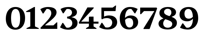
A bold, high-contrast serif font with pronounced serifs.
This is a classic serif font with strong, bold strokes and high contrast between thick and thin lines. The serifs are pronounced, giving it a traditional and authoritative appearance.
Ideal for editorial design, book covers, formal invitations, and branding projects that require a classic and authoritative look.
Headlines, Logos, Editorial design
Balanced ascenders and descenders
https://www.whatfontis.com/GOOGLE_Platypi-600.font
Platypi 600 font
1420108
Jul 26 2024
https://d1ly52g9wjvbd2.cloudfront.net/img16/G/O/GOOGLE_Platypi-600A.png
https://d1ly52g9wjvbd2.cloudfront.net/img16/G/O/GOOGLE_Platypi-600A1.png
https://d1ly52g9wjvbd2.cloudfront.net/img16/G/O/GOOGLE_Platypi-600a.png
https://d1ly52g9wjvbd2.cloudfront.net/img16/G/O/GOOGLE_Platypi-600a1.png
https://d1ly52g9wjvbd2.cloudfront.net/img16/G/O/GOOGLE_Platypi-6000.png
https://d1ly52g9wjvbd2.cloudfront.net/img16/G/O/GOOGLE_Platypi-60001.png
Fonts
A bold, high-contrast serif font with pronounced serifs.
This is a classic serif font with strong, bold strokes and high contrast between thick and thin lines. The serifs are pronounced, giving it a traditional and authoritative appearance.
Ideal for editorial design, book covers, formal invitations, and branding projects that require a classic and authoritative look.
Headlines, Logos, Editorial design
Balanced ascenders and descenders
Download Platypi 600 font. Platypi 600 by Copyright 2024 The Platypi Project Authors (https://github.com/d-sargent/platypi)
Ideal for editorial design, book covers, formal invitations, and branding projects that require a classic and authoritative look.
Headlines, Logos, Editorial design
Balanced ascenders and descenders
See the font with your own custom text

Category
Serif
Bold
Yes
Italic
No
Weight
Bold
Width
Normal
Character spacing
Normal
Line height
Normal
Contrast
High
Overall style
Classic
X height
Medium
Cap height
Tall
Proposed projects
Ideal for editorial design, book covers, formal invitations, and branding projects that require a classic and authoritative look.
Use case
Headlines, Logos, Editorial design
Ascender descender ratio
Balanced ascenders and descenders
WhatFontIs Blog
Understanding the Different Categories of Fonts

Latest from the WhatFontIs Forum

Help your fellow font-seekers if you think you can recognize the font. Earn some good karma by doing it :-) Answer & Help
Yet sometimes the images are very complex, so other users need a bit of help.
If you recognize the font from the samples posted here don't be shy and help a fellow designer.
Thousands of designers (famous or not) use the image font detection system to find a font or similar free fonts from an image. Although we have the largest database of fonts, the search for a font from an image gets mixed results like the image above.